County Health Mapping
building a choropleth template with ArcGIS JS API

One of the most interesting USA geospatial data sets in existence is the county health rankings released by the Esri demographics team. Here is a link to 2023 (which I use throughout this post) county health service 2023
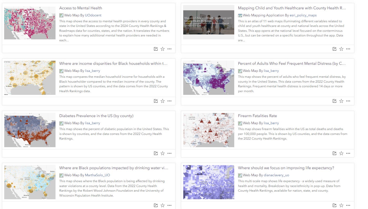
If you visit Esri’s living atlas site, you’ll see a nice gallery of interactive web maps prepared using this service. map gallery
I was interested in working with this data in a similar way, using the ArcGIS JS api. I created a template using the api alongside a bootstrap dashboard template to display a handy ranking window. You can find the repository here: github repo
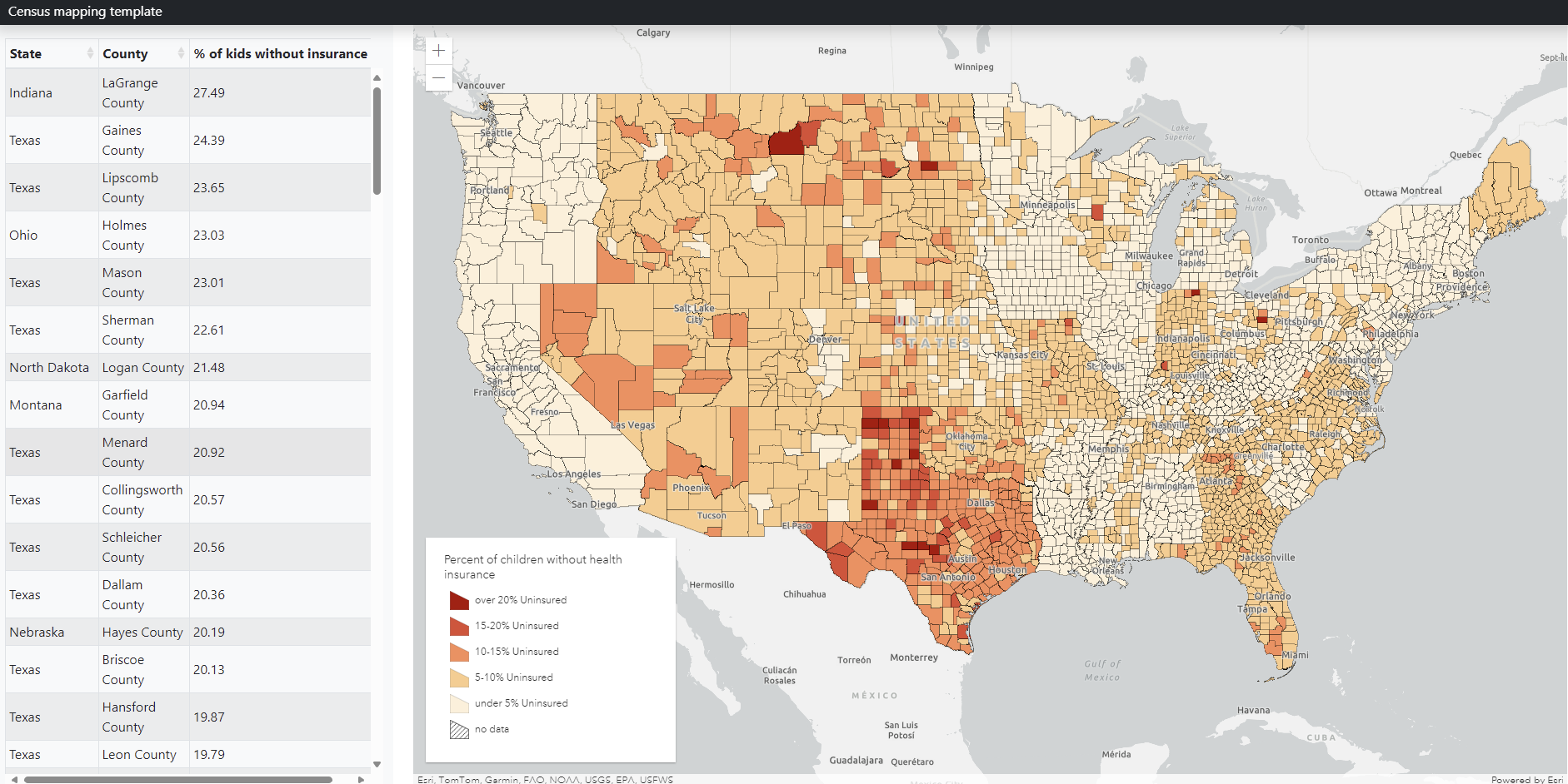
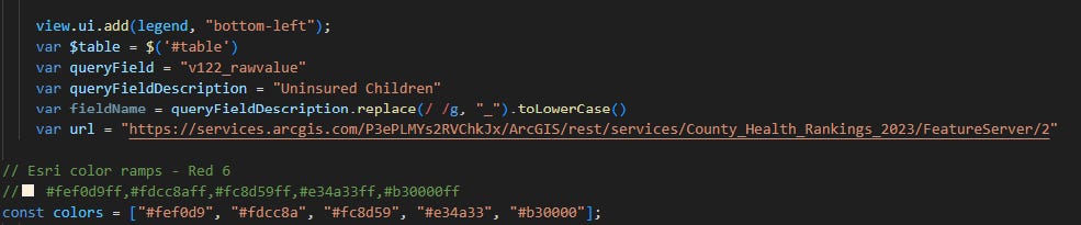
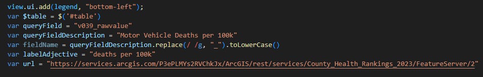
At the top of the map.js file you’ll see some variables assigned. This is where you can change the field being queried as well as the custom color ramp you want. For the example in the repo, I am using the percentage of people under 18 years of age with no health insurance (also pictured above)
The difficulty with mapping county-level data using feature services is that by default, the maximum returned records are limited to 2,000. Being that there are over 3,000 counties in the US, this becomes a problem.
I got around this by querying the first 2,000 OBJECTIDs, then querying the remaining once that query was finished. This is done using a nested promise structure
 loadData.then(()=>{
      var loadMore = new Promise((resolve, reject)=>{
        let query2 = url.createQuery();
        query2.where = "OBJECTID >= 2000"
        query2.returnGeometry = true;
        query2.outFields = [ queryField, "OBJECTID", "Name", "State" ];

        url.queryFeatures(query2)
        .then(function(response){
        console.log(response)
        response.features.forEach(function(feature, index){
            let gfx = new Graphic({
                geometry: feature.geometry,
                attributes: {"queryField": feature.attributes[queryField] , "county": feature.attributes.NAME, "state": feature.attributes.State,  "ObjectId": feature.attributes.OBJECTID}
              });
              var state = feature.attributes.State
              var county = feature.attributes.NAME
              var qf = feature.attributes[queryField]
              graphics.push(gfx)
              if(qf > 15 || qf <2 && qf != null){
                $table.bootstrapTable('insertRow', {
                            index: index,
                            row: {
                              county: county,
                              state: state,
                              qf: qf
                            }
                            })
                      }
                if(index == response.features.length -1){
                    resolve()
                }
        })
        });
      })
      loadMore.then(()=>{
        var fl = new FeatureLayer({
          title: "",
            source: graphics,
            objectIdField: "ObjectId",
            fields: [{
              name: "ObjectId",
              type: "oid"
            }, {
              name: "State",
              type: "string"
            },
            {
                name: "County",
                type: "string"
              }, {
                name: "queryField",
                type: "double"
              },
        ],
            popupTemplate: {
              content: "State: {State} <br>" +
               "County: {County} <br>"+
               "queryField" + ": {qf}%"
            },
            renderer: renderer
        })
        map.add(fl)
      console.log('map loaded')
      })

     })

  })
By changing the queryField variable and other variables at the top of the document and adjusting the class breaks you can easily adjust what is displayed on the map and in the info table
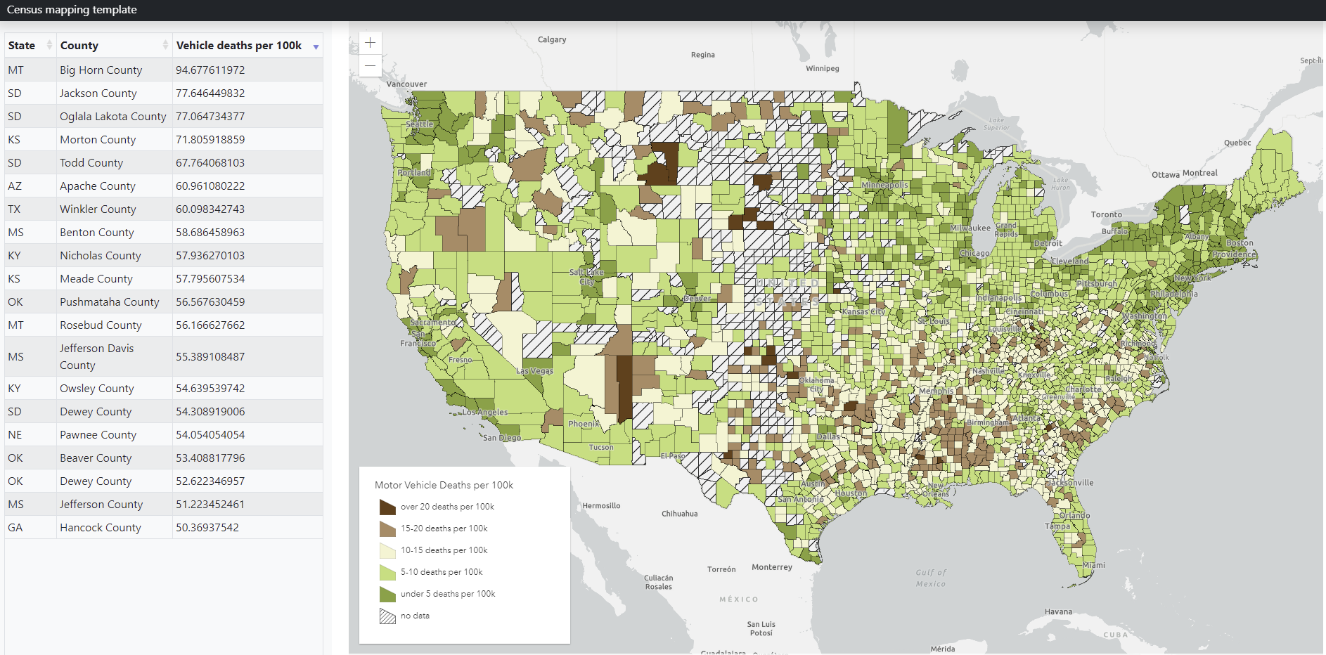
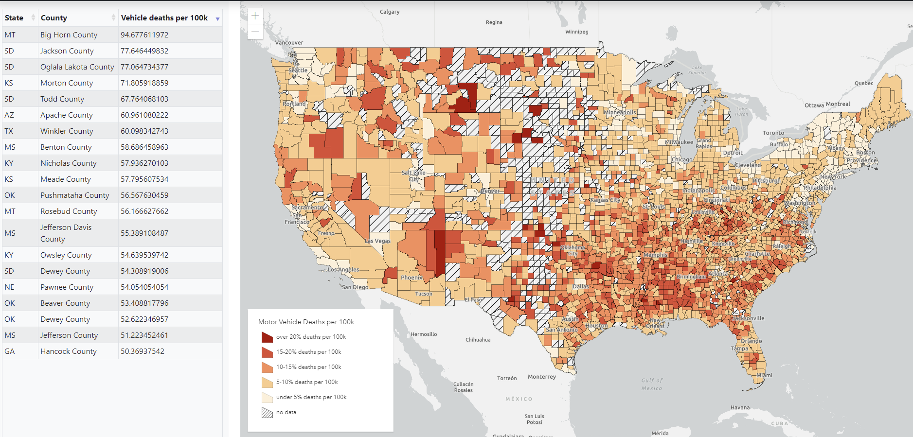
Here is a new map showing motor vehicle fatality rates per 100k people
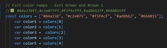
Esri also has a lovely repository of color ramps. In the past I have chosen custom ramps, but I have realized that picking colors is not my strongsuit. Here is a link to the color ramp library color picker
Here I have copied a new color ramp and swapped them into to the ramp for my class breaks object:
And here is the resultant map.